 Anthony
 Landing Pages For Facebook And Instagram Ads
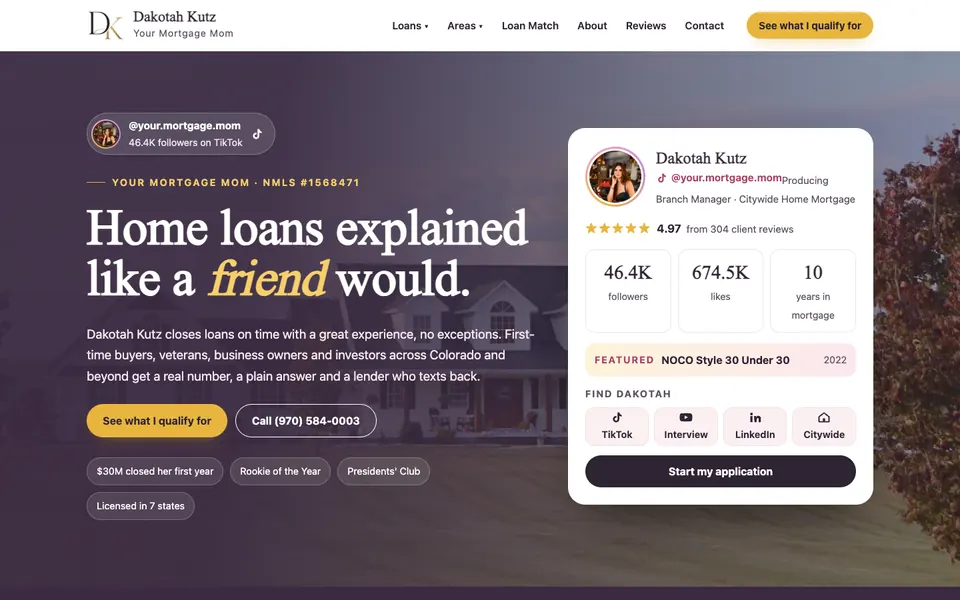
A landing page for Facebook and Instagram ads should do one thing: match the ad, make one offer and get the visitor to take one action on a phone. If your ad promises a free quote and the page opens with your company history, the click is wasted. Most ad money is lost on the page, not in the ad.
We audit a lot of ad accounts, and the pattern is boring. The ad is fine. The link goes to the home page. The home page has a menu with nine items, a slider and a paragraph about "our story." Nobody tapped the ad to read about you.
Key points
- Most Facebook and Instagram traffic arrives on a phone. Design for a thumb first.
- Message match: the headline on the page repeats the promise in the ad.
- One page, one offer, one button. Remove the main menu.
- Keep forms to three fields unless you have a reason for more.
- Speed matters. Google's research found over half of mobile visits are abandoned past three seconds of load time.
- Track clicks and leads with the Meta Pixel and server side events, and test one change at a time.
Why A Home Page Is Not A Landing Page
Someone scrolling Instagram did not go looking for a plumber. They were interrupted. You have about two seconds to remind them why they tapped. A home page tries to serve everyone: new customers, old customers, job seekers and vendors. A landing page serves one person with one problem.
Compare the two.
| Home page | Landing page | |
|---|---|---|
| Goal | Many | One |
| Navigation | Full menu | None or minimal |
| Headline | Brand statement | Matches the ad |
| Calls to action | Several | One |
| Best for | Search, direct visits | Paid traffic |
If you send ad traffic to your home page, you are paying to distract people.
Message Match
Say your ad reads "Free Roof Inspection In Ontario This Week." The page headline should read almost the same. "Free Roof Inspection In Ontario" is the first thing they see, in big type, with a button.
When the page does not match, people think they landed in the wrong place and leave. This is the cheapest improvement available. Rewrite the headline to copy the ad. Do that before touching anything else.
Also match visuals. If the ad shows a photo of a finished kitchen, the page should show that same kitchen.
What Goes On The Page, In Order
Keep it short. For most local services, this order works.
- Headline and subhead. The offer, the place and the main benefit.
- The action. A tap to call button and a short form, right at the top, no scrolling needed.
- Proof. Star rating, review count, a couple of short reviews, years in business, licenses.
- How it works. Three simple steps.
- What is included or what it costs. Prices or ranges when you can.
- Real photos. Your team, your work, your truck.
- A short FAQ. Three to five questions that remove doubts.
- A second action block. Repeat the call and the form at the bottom.
Leave out the long history, the awards wall and the blog links. You can show them on your main site.
The Form
Every field you add loses people. For a first contact, use:
- Name
- Phone
- A short box for what they need
That is it. You can ask more after you call. If you need a ZIP code to know whether you serve them, ask for that too and nothing else.
Add a plain line of consent near the button if you will text them. Make the button say what happens: "Get My Free Quote" beats "Submit."
On mobile, a tap to call button above the fold is often your best performer for urgent trades. Let people pick the way they prefer: call or form.
Speed On Phones
Test the page on a real phone over cellular data, not on your office wifi. Aim for the main content to appear in about two seconds.
The usual speed killers:
- Giant uncompressed photos. Use WebP or well compressed JPEGs.
- Autoplay video above the fold.
- A page builder loaded with scripts you do not use.
- Chat widgets that load before the page content.
A lean static page often beats a heavy builder page. Fast pages also let you pay less per click, because fewer people leave before the page loads.
Facebook Lead Forms Versus A Landing Page
Meta offers instant lead forms that open inside the app. They are easy and cheap to get going. The tradeoff is quality: it takes one tap to submit, so you get more leads who barely remember doing it.
| Instant form | Landing page | |
|---|---|---|
| Cost per lead | Usually lower | Usually higher |
| Lead quality | Often lower | Often higher |
| Setup | Fast | More work |
| Control | Limited | Full |
| Tracking | In Meta | Your own tools plus Meta |
If you do not answer leads quickly, neither wins. See speed to lead before you spend a dollar.
My rule: try both for a week with the same offer and compare booked jobs, not leads.
Tracking You Need Before Spending
You cannot fix what you cannot see.
- Meta Pixel installed on the page, with a Lead event firing on form submit.
- Conversions API if your setup supports it. Browser privacy tools and iOS limits mean pixel only tracking misses people.
- Call tracking so you know which calls came from the ad.
- UTM tags on the ad links, so your analytics shows source and campaign.
- A single place where every lead lands, with a timestamp.
Then track the number that matters, cost per booked job. Cost per click is a vanity number.
How To Test Cheaply
Change one thing at a time and give each version enough traffic to mean something. A few dozen visits proves nothing. Pick a window, such as a week, and keep other variables fixed.
Test in this order:
- The headline.
- The main photo.
- The button text.
- The form length.
- The offer itself.
If a test wins, keep it and test the next item. If you are spending small, do not obsess over statistical tools. Look for big differences and ignore small ones.
Common Mistakes We See
- Sending traffic to the home page.
- A different phone number than the ad or site, with no tracking.
- No thank you page, so you cannot count conversions.
- A form that breaks on iPhone.
- A page that works on desktop only.
- No follow up. A lead who gets a text within a minute is a different animal from one who waits a day.
If you want design ideas for page layouts, browse the designs page. For a hands on review of your ads and pages, book a strategy call.
Questions
Do I need a separate landing page for each ad?
Not always, but each offer should have its own page. If two ads promise the same thing, they can share one page. If the promise is different, the page should change too.
How long should a landing page be?
As long as it takes to answer a visitor's doubts, and no longer. Many local service pages work well at a few screens on a phone. Higher priced services often need more proof and detail.
Should I use my website or a separate tool?
Either works. What matters is speed, a clean layout, tracking and control over the content. A simple page on your own domain is often best.
What is a good conversion rate?
It varies by industry and offer, so I do not trust one number. Measure your own page, improve it and compare each version against your last one.
Want my new posts near the top when you search? Pick Anthony Limpert as a preferred source on Google and Google shows them to you more often in Top Stories.