Telecom Utilities And Consumer Design · 209 of 210

Counter Pop

Bright white and tomato red with a lemon highlight and wide, loud headings, like the sale sign in a strip mall window. It fits a local phone store that sells plans, fixes screens and knows its regulars by name.

Built for Wireless Store and Phone Repair. Sample business on the page, Red Bluff Wireless, Pasadena TX.
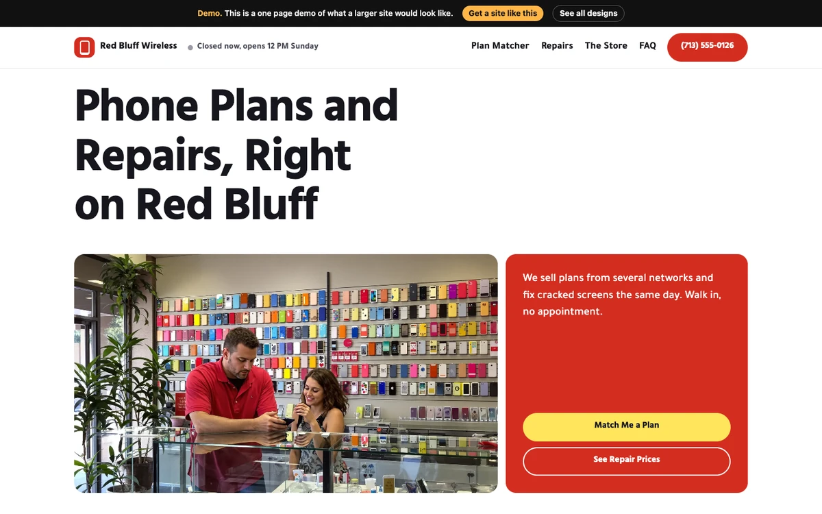
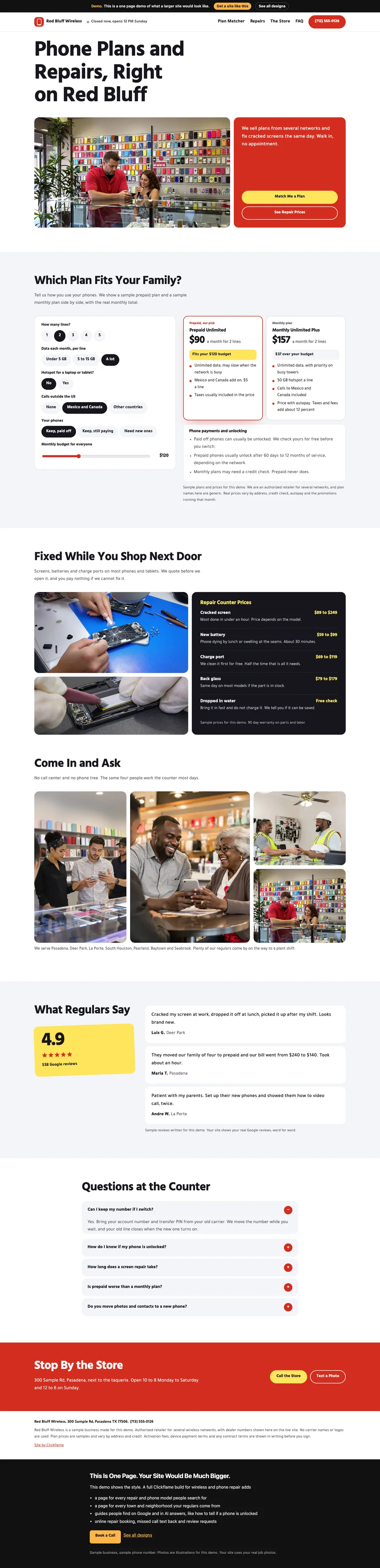
Counter Pop website design on a desktop
The first screen, “Phone Plans and Repairs, Right on Red Bluff”

Colors

#d42d20
#ffe45c
#16161d
#b92418

Fonts

  • Hind Mysuru
  • Tajawal

Sections In Order

  1. Phone Plans and Repairs, Right on Red Bluff
  2. Which Plan Fits Your Family?
  3. Fixed While You Shop Next Door
  4. Come In and Ask
  5. What Regulars Say
  6. Questions at the Counter
  7. Nav: Quick actions

Built In

  • live open now badge
  • one tap action bar
  • light-dark() dark mode
  • sibling-index() staggers
  • Tool on the page, Cell plan matcher
  • FAQ accordion
  • Click-to-call phone links
  • Form
  • Sticky header/bar
  • Range slider input

The Whole Page

Full page of the Counter Pop design

On A Phone

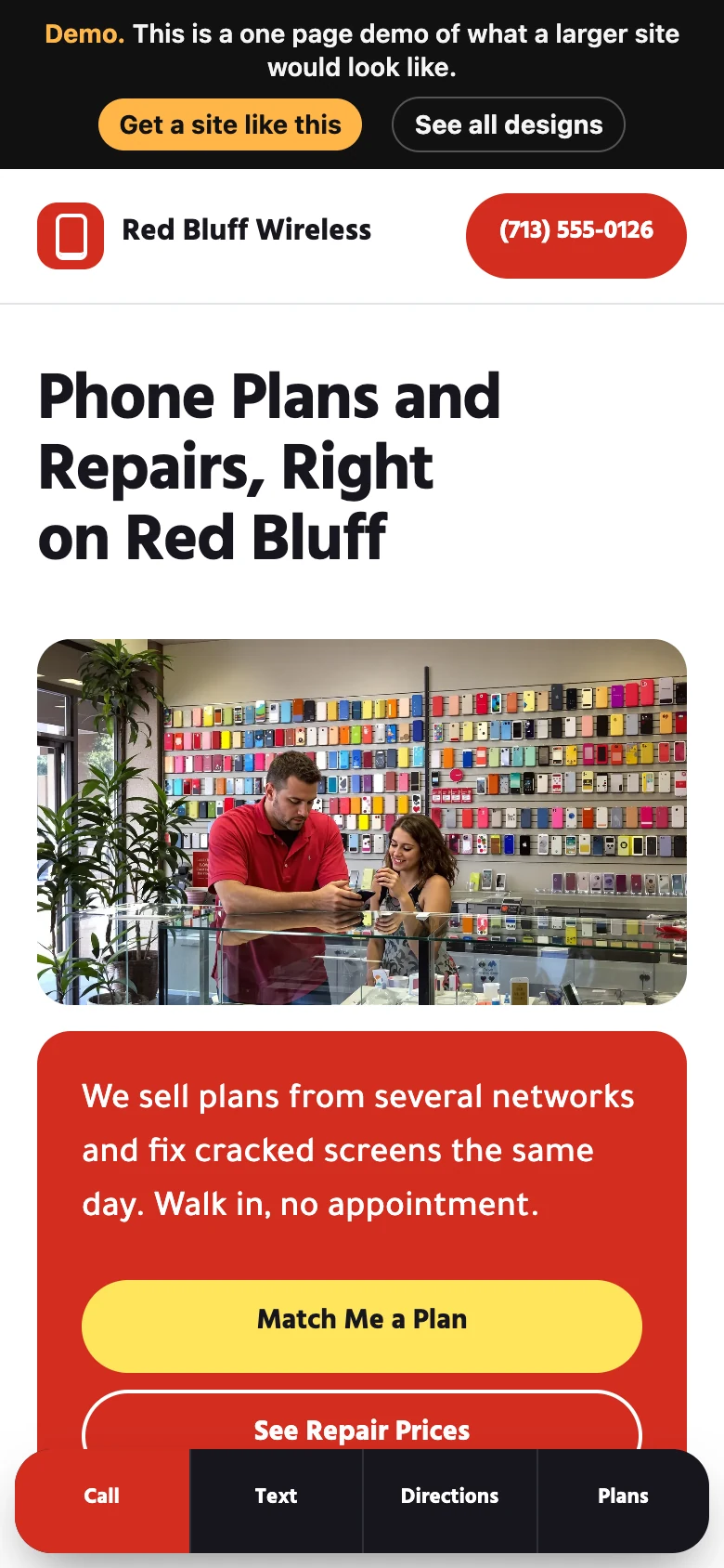
Counter Pop on a phone
↑