Health And Medical Design · 195 of 210

Soft Anatomy

Cool morning blue, deep ink and a berry red used only where it matters, with big clear type for older eyes. It feels like a patient chart drawn by a kind doctor, built for someone whose legs ache by supper.

Built for Vein Clinic. Sample business on the page, Barren River Vein Center, Bowling Green KY.
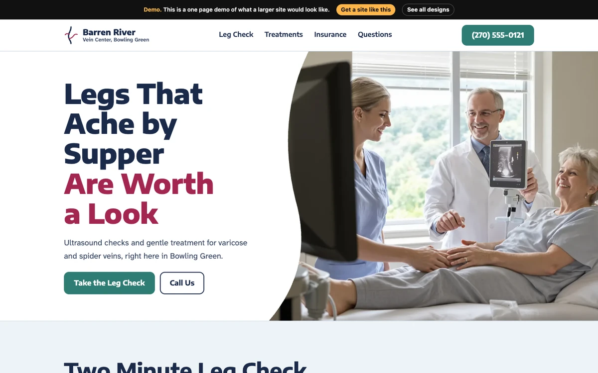
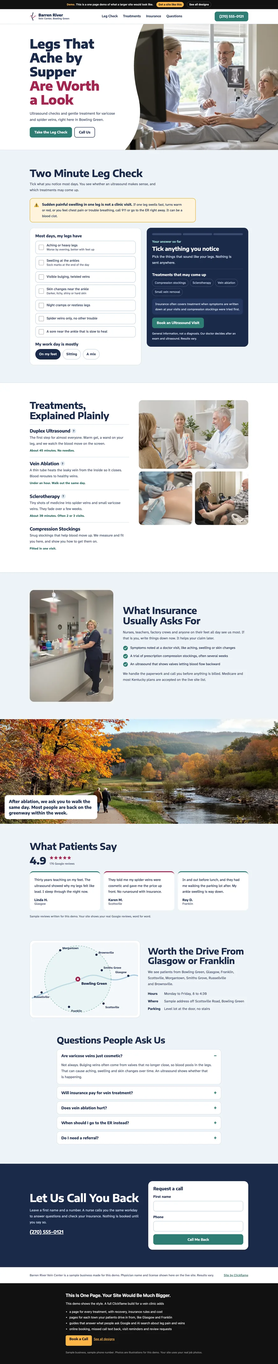
Soft Anatomy website design on a desktop
The first screen, “Legs That Ache by Supper Are Worth a Look”

Colors

#1b2a4a
#3c4a66
#2f7d74
#c9d6e2
#a3264f
#eef3f7

Fonts

  • Encode Sans Semi Expanded
  • Atkinson Hyperlegible Next

Sections In Order

  1. Legs That Ache by Supper Are Worth a Look
  2. Two Minute Leg Check
  3. Treatments, Explained Plainly
  4. What Insurance Usually Asks For
  5. Walking after treatment
  6. What Patients Say
  7. Worth the Drive From Glasgow or Franklin
  8. Questions People Ask Us
  9. Let Us Call You Back
  10. Nav: Quick actions

Built In

  • shape() curved hero edge
  • SVG service area map
  • popover tooltips with anchor positioning
  • one tap action bar
  • Tool on the page, Leg symptom check
  • FAQ accordion
  • Click-to-call phone links
  • Form
  • Sticky header/bar
  • Inline SVG graphics

The Whole Page

Full page of the Soft Anatomy design

On A Phone

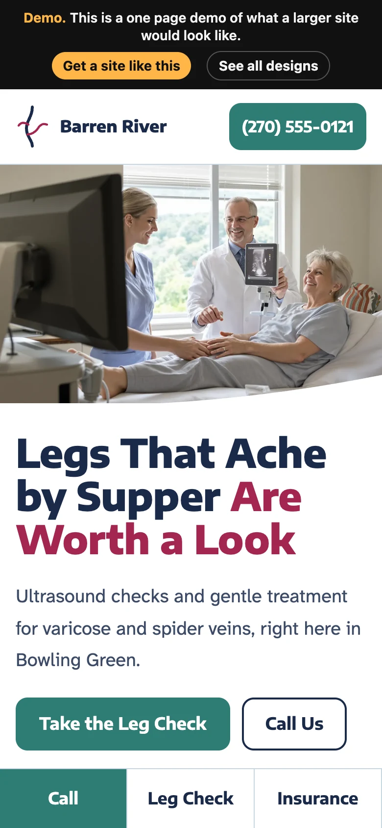
Soft Anatomy on a phone
↑